Line Graph Maker: How to Plot Data Over Time
A line graph maker is an online tool that turns labels and numbers into a line graph, so a trend across days, months or years shows at a glance. Type or paste the data, label both axes, pick colors and download the image. Five steps cover the whole job. The sections below walk through each step, the settings worth changing and the mistakes that distort a trend, with a real example built from 2024 California gasoline prices.
In this article:
- What is a line graph maker?
- How do you make a line graph in 5 steps?
- How did California gasoline prices change in 2024?
- When should you use a line graph?
- Which chart fits when a line graph does not?
- Which features matter in a line graph maker?
- What mistakes distort a line graph?
- How do you make a line graph easy to read?
- Who invented the line graph?
- Line graph maker or Excel: which fits better?
- Frequently asked questions
- Conclusion
- Sources
What is a line graph maker?
A line graph maker is software that plots ordered values as points and joins the points with straight line segments. Time or another ordered sequence runs along the horizontal axis (x-axis). The vertical axis (y-axis) carries the measured value, such as prices in dollars, sales in units or temperatures in °F (degrees Fahrenheit) and °C (degrees Celsius).
Atlassian describes the x-axis as a continuous progression and the y-axis as the metric being tracked. Slopes carry the message: a rising line means the value increased, a falling line means the value decreased, and a flat stretch means no change. Most makers redraw the graph as data goes in, so a typo or a wrong unit takes seconds to fix.
How do you make a line graph in 5 steps?
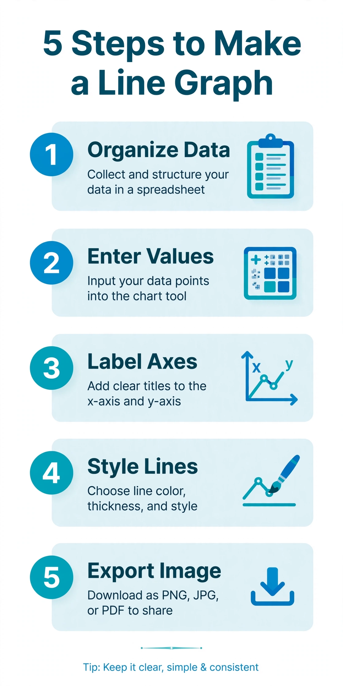
Make a line graph in five steps: organize the data, enter the values, label the axes, style the lines and export the image. The order stays the same in Excel, Google Sheets and any online line graph maker.
- Organize the data in two columns. Put time labels, such as months or years, in the first column and numeric values in the second. Keep the intervals regular: one value per day, per week or per month, never a mix. Each extra column of values becomes an extra line.
- Enter the labels and values. Type the labels and values into the data table, or paste cells from a spreadsheet if the maker accepts pasted data. A CSV (comma-separated values) file works too when the maker supports uploads.
- Label both axes and add a title. Write the units, such as dollars, gallons and degrees, in each axis label so readers never guess the measure. A title like “Average California gasoline price per gallon, 2024” names the subject, the place and the period.
- Style the lines. Give each line a distinct color, show a marker at every observation when the series is short and set the y-axis range to the span where change is visible.
- Export the image. Download a PNG (Portable Network Graphics) file for slides and documents, or an SVG (Scalable Vector Graphics) file for sharp scaling in print, if the maker offers both formats.
Mathematics LibreTexts teaches the same sequence for hand-drawn graphs: tabulate the data, set up and label the axes, plot the points, connect the points in order and add a title and legend.
How did California gasoline prices change in 2024?
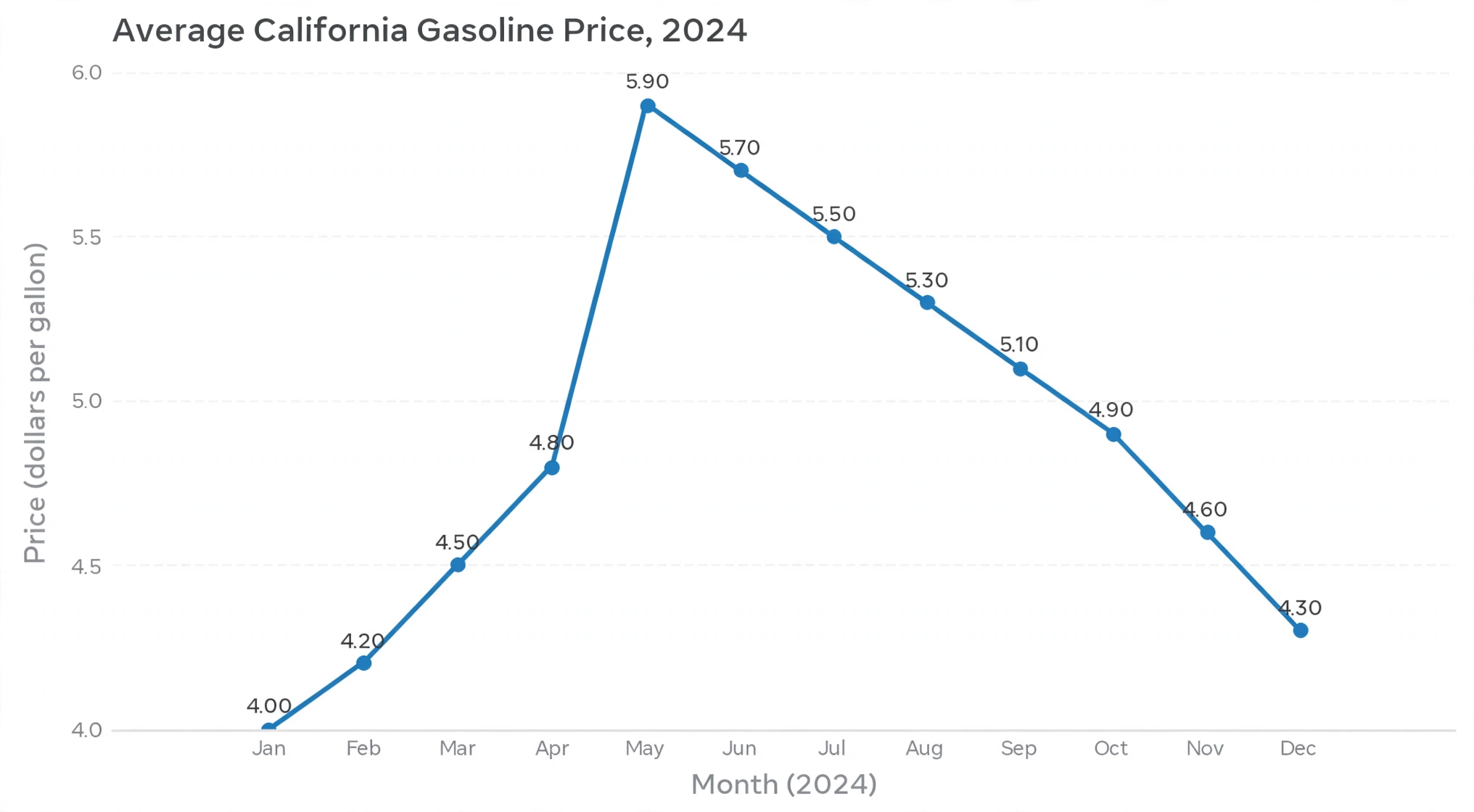
Regular gasoline in California rose from $4.482 per gallon in January 2024 to a peak of $5.518 in May, then fell to $4.243 by December. In liters, those prices are about $1.18, $1.46 and $1.12 per liter. The figures are monthly averages from the U.S. Energy Information Administration (EIA), reproduced in a Mathematics LibreTexts exercise.
Three facts stand out once the 12 monthly values are plotted. Prices rose in each of the 4 months from February ($4.535) to May. The sharpest move was May to June, a drop of $0.741 per gallon (about $0.20 per liter). September ($4.574) interrupted the slide in the second half, and December closed the year at its lowest point.
Mathematics LibreTexts draws the y-axis from $4.00 to $6.00 in $0.20 steps, which lets the $1.275 spread between the highest and lowest months (about $0.34 per liter) fill the plot. A zero-based axis would squeeze that spread into about 21% of the graph height.
When should you use a line graph?
Use a line graph when the x-axis holds ordered values at regular intervals and the goal is to show change. Four situations fit best:
- Track one metric over days, weeks, months or years.
- Compare two to five series on a shared timeline.
- Spot seasonality, spikes and dips in a series.
- Show progress toward a goal, such as savings, test scores or weekly mileage.
Line count and series length both matter. Atlassian puts the readable limit at five lines, Mathematics LibreTexts and Ablebits advise 3 to 4, and Ablebits recommends data sets under 50 values.
Which chart fits when a line graph does not?
Choose a bar chart for unordered categories, such as countries or product lines; a pie chart for parts of a whole; and a scatter plot for the relationship between two numeric variables. Mathematics LibreTexts lists these three alternatives. Ablebits adds a Gantt chart for project schedules.
Which features matter in a line graph maker?
Five features matter most: data import, multiple series, axis control, trend lines and export formats. Each feature removes a specific chore:
- Data import removes retyping. Pasting spreadsheet cells or uploading a CSV file moves a long series into the graph without manual entry.
- Multiple series supports comparison. Two to five lines cover most comparisons, from product lines to regions.
- Axis control shows the real movement. Custom minimum and maximum values zoom the y-axis, and a logarithmic scale handles data that spans several orders of magnitude.
- Trend lines summarize direction. A linear trend line draws the overall slope through noisy points.
- Export formats fit the destination. PNG suits slides, SVG suits print and PDF (Portable Document Format) suits client handoffs.
Extras such as themes, fonts and transparent backgrounds improve appearance without changing what the data says.
What mistakes distort a line graph?
Five mistakes distort line graphs most often: too many lines, dual axes, smoothed curves, hidden gaps and the wrong time interval. Atlassian’s guide to line charts covers each one.
- Too many lines. Keep a graph to five lines or fewer, and split larger sets into small side-by-side graphs.
- Dual axes. Two y-axes let the chosen scales dictate the apparent relationship between series, so plot the two series in separate graphs.
- Smoothed curves. A curve through the points implies measurements between observations that never happened, so use straight segments.
- Hidden gaps. Missing months read as real values unless a dot marks each observation, so show markers or break the line.
- Wrong interval. A wide interval hides the trend and a narrow interval shows noise, so test daily, weekly and monthly views and add a rolling-average line for noisy data.
Axis range follows a separate rule: a line graph can zoom the y-axis to the informative range, but a bar chart must start at zero.
How do you make a line graph easy to read?
Make a line graph easy to read by labeling units, limiting color to what carries meaning and annotating the events that explain the shape. Four habits do most of the work:
- Name the unit in every axis label and the period in the title.
- Mark key events, such as a policy change, a product launch or a price shock, with short notes on the graph.
- Pair color with a second cue, such as dashed lines or distinct marker shapes, so color-blind readers and black-and-white printouts still work.
- Write alt text that states the trend in one sentence, for example “Gasoline prices peaked at $5.518 per gallon in May 2024.”
When a graph carries more than three series, color one line and gray the others to point readers at the story.
Who invented the line graph?
William Playfair, a Scottish engineer and political economist, is credited with introducing the line chart in 1786 in The Commercial and Political Atlas. The William Playfair entry on Wikipedia records that the book held 43 time-series plots and 1 bar chart, and that its line chart tracked England’s balance of trade with other nations using customs data. Playfair lived from September 22, 1759 to February 11, 1823, and argued that charts communicate better than tables of data. Modern makers keep his design: one ordered axis, one measured value and a line that shows direction.
Line graph maker or Excel: which fits better?
Excel fits data that already lives in a workbook; an online line graph maker fits a quick chart from a small table that must leave the spreadsheet as an image. In Excel, select the data, open the Insert tab, click Insert Line or Area Chart and choose 2-D Line, per Ablebits. Excel offers stacked, 100% stacked, marker and 3-D variants, plus sparklines for a tiny graph inside one cell. A maker skips the workbook, so a person with 10 rows of numbers reaches a finished PNG faster. Pick Excel when the data changes weekly, and pick a maker when the graph is a one-off.
Frequently asked questions
Conclusion
A line graph maker earns its place whenever the data has one ordered axis, five or fewer series and a story about change. Organize two columns, keep the intervals regular, label the units and skip the smoothing. The California gasoline example shows the payoff: 12 monthly values, a $5.518 peak in May 2024 and a $0.741 drop in June, all readable in one glance. Open a line graph maker, paste a small table and plot the trend you need to explain.
Sources
- A Complete Guide to Line Charts, Atlassian
- 6.6: Line Graphs, Mathematics LibreTexts
- How to create a line graph in Excel, Ablebits
- William Playfair, Wikipedia